AT SECOND GLANCE
Porcelain, politics and poetry in artistic liaison: KPM+ Rona Kobel reinterprets a Bauhaus icon and shows that the beautiful form can also become a perfectly shaped manifesto.
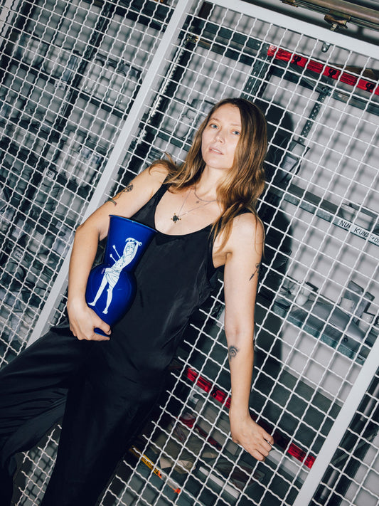
"Freedoom" vases in candy colors
Rona Kobel is a visual artist who lives and works in Berlin. She is a lecturer at the University of the Arts.
Rona, how did you and KPM Berlin find each other?
I was a master student at the University of the Arts and started working with porcelain in the last year of my studies. But the problem was that the UdK doesn't have its own porcelain kilns, so I had the idea of simply asking the neighbors, because the KPM is very close by. That was almost ten years ago.
Does that mean you simply carried your work from university across the streets?
Exactly, it was a pretty risky business, especially on bumpy sections. Every now and then an arm or something similar would break.
What attracts you to porcelain, where does your enthusiasm for it come from?
Porcelain is a noble material. But then to use such a material to deal with unpleasant topics creates irritation. Wrapping moments and stories of horror in something so beautiful, so precious, draws attention to important themes. Added to this is the three-dimensionality, which forces the viewer more strongly to engage with the object and thus the theme. Especially as we are all totally inundated by the media. The porcelain makes it easier for us to look again.
Now you have discovered the HALLE for yourself, why this model?
I first came across the vase and its designer, Marguerite Friedlaender, in 2019 as part of the Bauhaus anniversary celebrations. For one thing, the shape is beautiful and timeless; for another, its history is incredibly interesting. Friedlaender was forced to emigrate to the U.S. as National Socialism was on the rise, and her name was removed from the vase’s production records; the product was thus sold anonymously for the time being, and its designer was erased from history. I then searched through old letters and documents in the archives, looking for her signature with her full name—which was really difficult—and finally Halle it in the archives of Burg Giebichenstein in Halle .
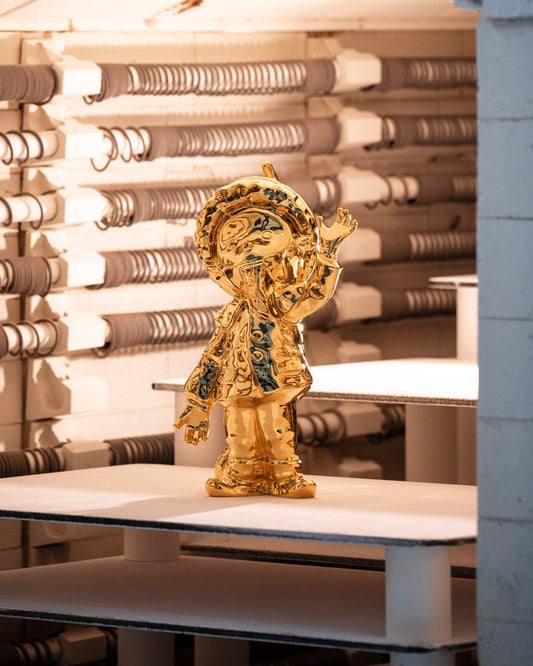
Kobel paints each drop of the lustre paint vase individually by hand, so each object has a different gradient and is unique.
The signature of vase designer Marguerite Friedlaender was crossed out of the production sheets under National Socialism. The artist Rona Kobel put dots under the signature, an old correction mark, to make the crossed-out part valid again.
You have now dipped the HALLE in bright colors and let word reliefs grow over their bodies, how did the design process go?
The idea for the relief came first, I then borrowed models of the vases from the workshop and tried a few things out. When the designs were ready, I started to play around a lot with the painting. The smaller "Freedoom" vases are more cheerful and playful thanks to the pastel colors and the large bow, while the larger "CouRAGE" models are more sophisticated and serious. The relief casts beautiful shadows, which are picked up by the Biscuit and the luster color.
You just mentioned the names, what is behind "Freedoom" and "CouRAGE"? What does freedom mean to you, what does courage mean?
First of all, there is of course a direct reference to Marguerite Friedlaender, as her freedom and the freedom of the Bauhaus were brought to an abrupt end by National Socialism. Today we live in a free, democratic society with all the privileges of free development of the personality, freedom of expression, etc... Unfortunately, we are often far too little aware of how precious these fundamental freedoms are, how hard they have been fought for and how rare they are globally. Despite all the seriousness, humor and irony also play an important role and I like to work with these contrasts. You only discover the double o, the -doom in the lettering at second glance and the colorful vases smile mischievously at the viewer while warning of the fragility of freedom.
And CouRAGE...
.... stands for the necessary anger in the courage to change. RAGE is thicker and larger in relief to emphasize the second part of the word.
The vases oscillate between design and art, what unites the two disciplines, would you say?
Art and design are both creative and inventive, they bring something new into the world and act as a mirror of their respective times. While design follows a specific purpose or use, art is free - the greatest and sometimes the most difficult privilege of my profession as an artist. When art and design enter into a symbiosis, they can open up new spaces for each other - that's how I felt working with Marguerite Friedlaender's wonderful, timeless vases.
Cookie variant before pink
The blue "Freedoom" vase with watery eyes
Biscuit Courage before blue